錦盒辦公室
The Brocade Space
|
Located in the bustling Qingpu Special District within Taoyuan,The Brocade is the first collaborative workspace for Emerald Design and Brocade Space Marketing Agency 。
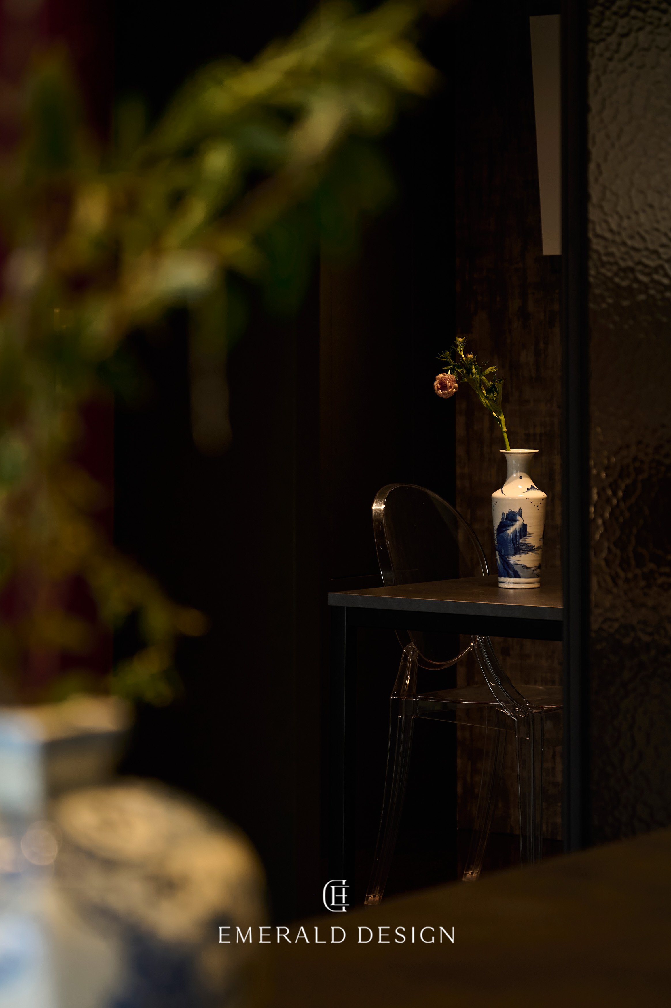
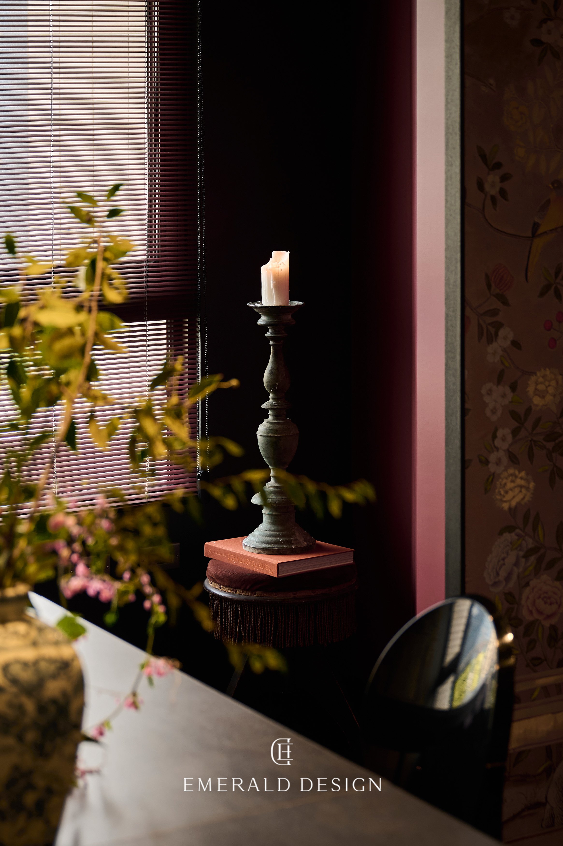
It features hues like vermilion, ochre, and indigo, which are the common colors used in ancient Chinese architecture. Right at the entrance of the office stands Sanyu’s painting , symbolizing the flourishing development of the two brands.
“Lanling's fine wine spreads a turmeric fragrant trace, Shining through jade cups with golden amber glow.”—Li Bai, “While Traveling”
The spirit of Eastern wisdom in these two verses runs through the entire design of the room, complemented by the embellishment of western elements. Inspired by the poem, we use the a dark cyan material interspersed with a golden shimmer as the room flooring, foreshadowing the rich turmeric infused in Lan Ling exquisite wine, and the amber glow as it fills the teacup.
The room's screen design shows the traditional concept of the brocade box. It is a traditional Chinese handicraft with high artistic value. Carved from wood and decorated with gold, silver, pearls, jade, and emerald, it perfectly complements the brocade lining fabric. The aesthetic charm of brocade gives artistic pleasure to the screens. Vibrant floral patterns on the screens are printed on silk fabric with some parts painted by hand. Moreover, the traditional Chinese needlework is used to embroider the fabric, intricately weaving together elements of time and cultural refinement.
As the partition screen wall portrays the logos of the brands, the spirit of inheriting each corporate’s philosophy is revealed through the creation. The interplay of blended and merged business images make a promising future blueprint gracefully unfold. Constructed in a square pattern, the layout of the spatial circulation is imbued with Chinese cultural significance. As guests walk through the spaces, their movements create a harmonious image evocative of two sides of yin and yang in Tai Chi, forming a symbol of completeness and fulfillment.
空間設計以中國傳統常用宮廷色——絳赤、赭色、鴉青為風格色調,入口迎向而來的常玉畫作《望月》象徵兩個品牌的融合共榮,如同花苞旺盛的生命力,生機盎然。回扣到翡閣設計本身,不僅擅長將東西方元素融匯,更將現代語彙與傳統意象結合,傳遞出成熟穩重而獨特的設計風格。也正是這樣的特色,與常玉作為最初接受傳統東方繪畫教育,而在中年轉為留法深受西方繪畫表現影響的背景不謀而合。常玉畫作《望月》流露出與空間、品牌的相互呼應──此圖由白花、雀鳥以及小貓匯聚而成, 盆花的造型
以方正的枝幹往上攀伸, 襯托出白花黑葉,象徵著花苞旺盛的生命力,生機盎然。用意不僅在整體色調、構圖上呼應著空間設計,更象徵著兩個品牌的特性及蓬勃發展的意象。
全室的地板板材概念源自於李白《客中行》一詩:「蘭陵美酒鬱金香,玉碗盛來琥珀光」,以暗青色中透有流光般灑金材質鋪設,呼應猶如蘭陵的美酒透着醇濃的鬱金,盛入茶碗之中透著琥珀般光澤。整體與空間中的線條形成點綴之外,迎面而來的方桌,整體以翡翠之中最高等級的祖母綠大理石呈現,紋理之中透著雲斑,更在桌腳上呼應兩個品牌的名稱,沿襲著品牌精神。回首間,壁面延伸後轉為斜角,留有一點視覺上的停留,更回應著東方建築的獨有特色;延續而上的天花板,以古典西方風格的線板裝飾呈現,璀璨以外更添氣韻,更是將東西方設計元素融合的語彙。
翡閣設計與錦盒行銷,作為帶有東方意象的品牌,空間的整體設計更加呼應著這樣的特色。空間中轉換的屏風,以旋轉門的概念呈現,其中圖樣更添意義。「錦盒」為傳統中國的手工藝品,以木盒雕刻,裝飾、鑲嵌金銀、珠玉、翡翠,並輔以外裱絲綢綾錦,內襯軟絮羅緞,彰顯其富貴與藝術價值;而此屏風更是以此為呼應,將富有生機的花團錦簇之意印刷於絹布之上,局部以繪製手法呈現,最後再以傳統中國之藝──刺繡一針一線縫上,將時間與文化涵雅縫紉其中。而在推開屏風之後,陰陽刻的木櫃牆面映入,其中將三個品牌刻劃於上,不僅以延續品牌精神,更是傳承各自理念,並以融合、匯聚的意象傳遞著未來的藍圖景象。
最後,整體空間以回字型構築,動線規劃上以富有中國文化內涵的回型巧思,在穿梭往來不同空間之時,賓客的行走痕跡如同太極陰陽之間,盤成一個偌大的圓滿,從而呼應並延續著品牌的精神。
Interior Design | Emerald Design
Furnishings | Emerald Design
Photography | Dayform Studio


